


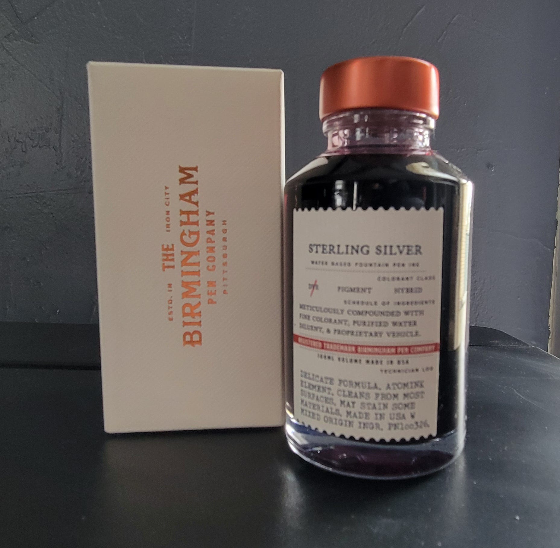
Birmingham Sterling Silver

Back again with another Birmingham ink. This time it's Birmingham Sterling Silver. This was a sample given to me by a new pen friend. She was sooo excited about it and I now know, for good reason. Sterling Silver is part of Birmingham's Delicate Formula fountain pen ink line. Birmingham describes this ink as best for delicate vintage pens and easily washable from most surfaces with soap and water. So this is a really gentle ink. Initially, I was hesitant to put a review out there, only because the ink was not in stock. Last week I found out that the ink is now back in stock, and still is, at the time of this writing. Birmingham sells this in 100ml bottles, for $19usd, heck of a deal. I had to pick up a bottle. This is the biggest bottle I own now and could probably last me for the rest of my life. LOL.
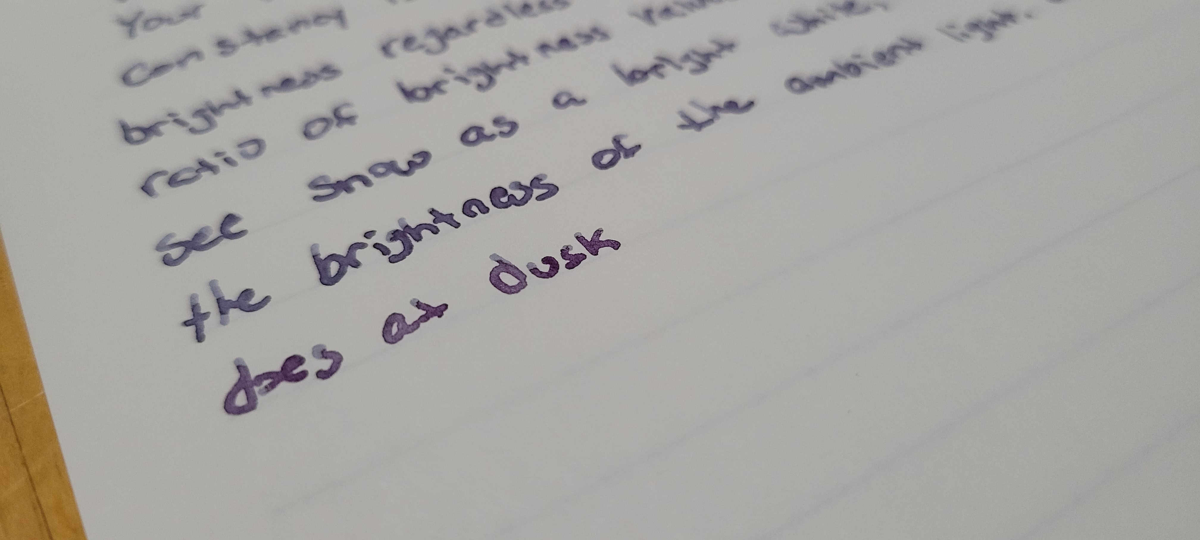
On the Birmingham website the color swatch is a cool grey and shows some shading. I’d say my swatch is fairly close, a little darker, to the Birmingham swatch on their website. I inked this up in a TWSBI Eco with a broad nib. This ink was a nice matchy matchy with the new TWSBI Slate Blue and Onyx pen. It was really neat seeing the purple hue in the pen when the ink sloshed around.
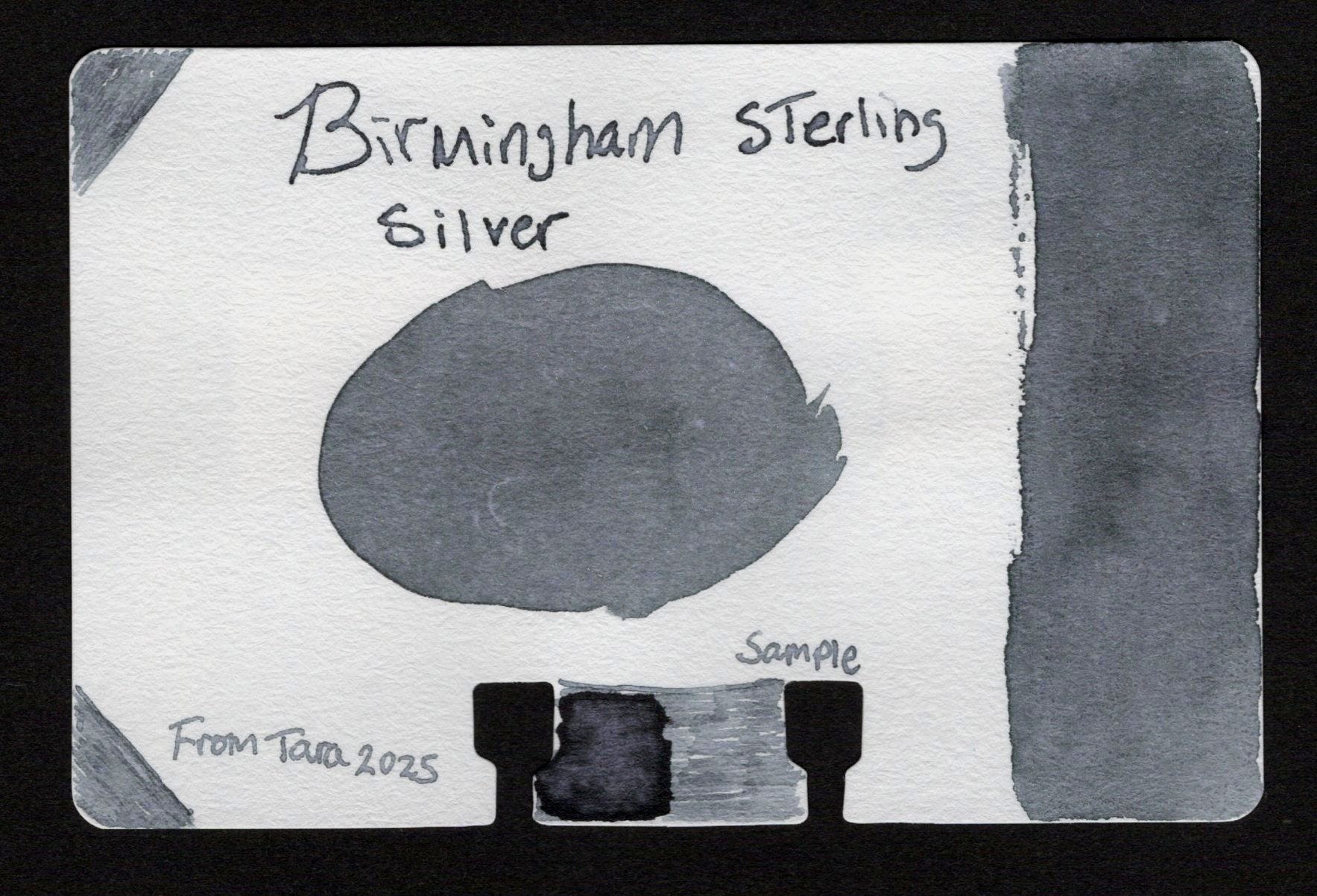
In larger swatches the ink starts off as a dusty purple color that as it dries turns this beautiful cool toned grayish-blue. It's meant to look like tarnished silver and I think Birmingham did a great job capturing this effect. The swatch below was done with the Dominant Industry ink muddle on Mnemosyne paper. Yes! This is the same ink, can you believe it?
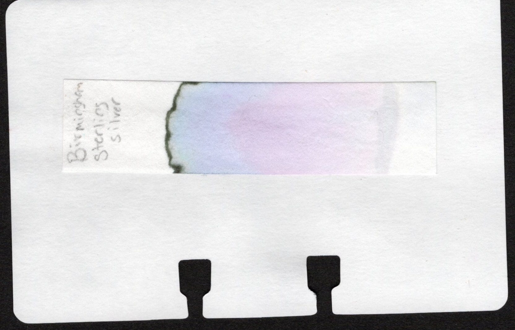
The chromatography shows light mix of rose, purple and blue with a heavy grey line at the top. Same effect in the writing as it dries.
Sample writing, swatches and line variation tests on small test notebooks from Mauraman Mnemosyne, Apica, Travelers, Rhodia, and Clariefontaine. These swatches are done with Dominant Industry's new ink muddler. A tool I've been using more often to do my swatches, both in my small testing notebooks and on my swatch cards. On the Apica paper, I laid down way to much ink for the swatch and had to dab it dry with a paper towl, it bled through almost immediately, but that’s expected. The writing did not bleed through. You can see the heavy shading here.
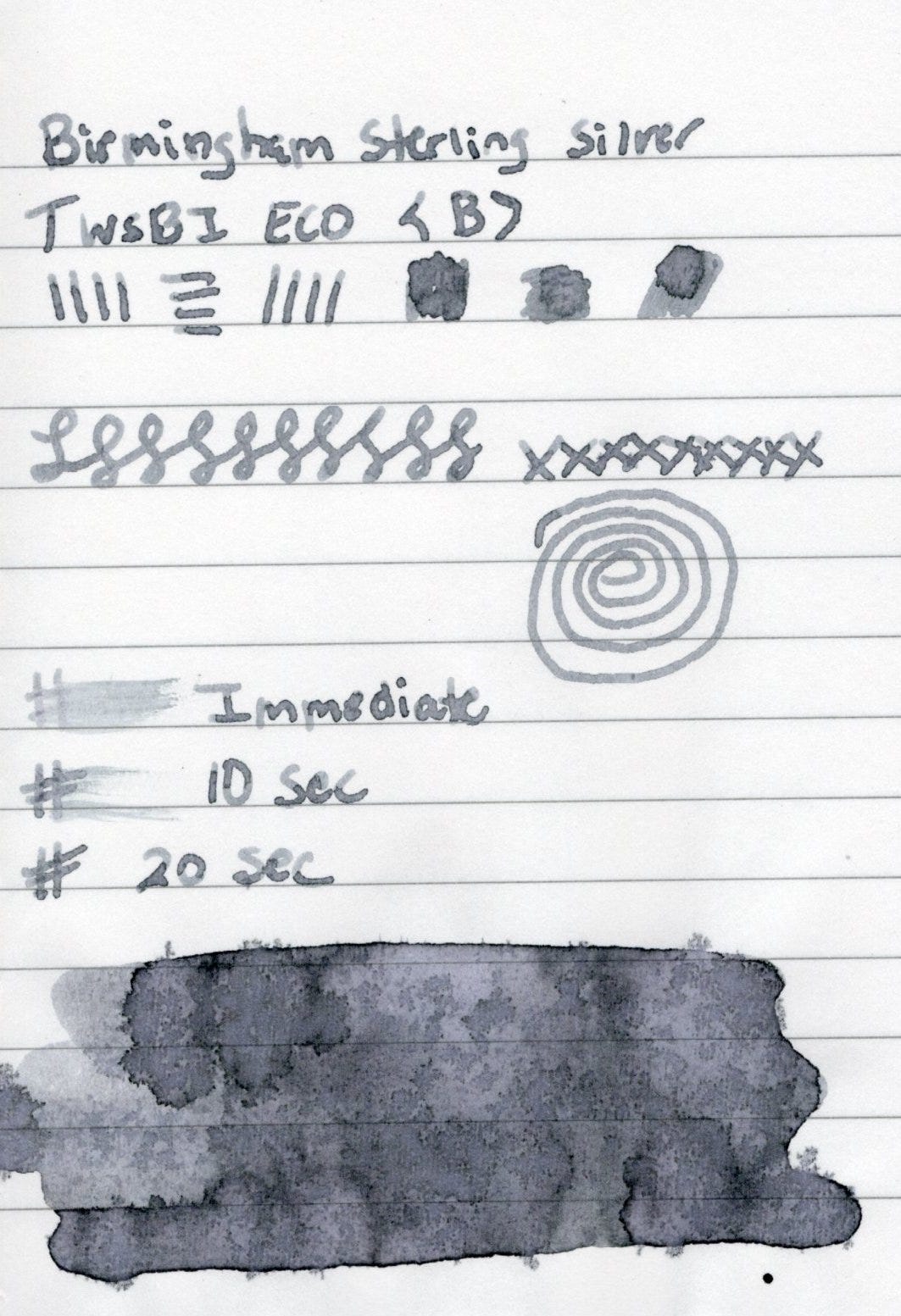
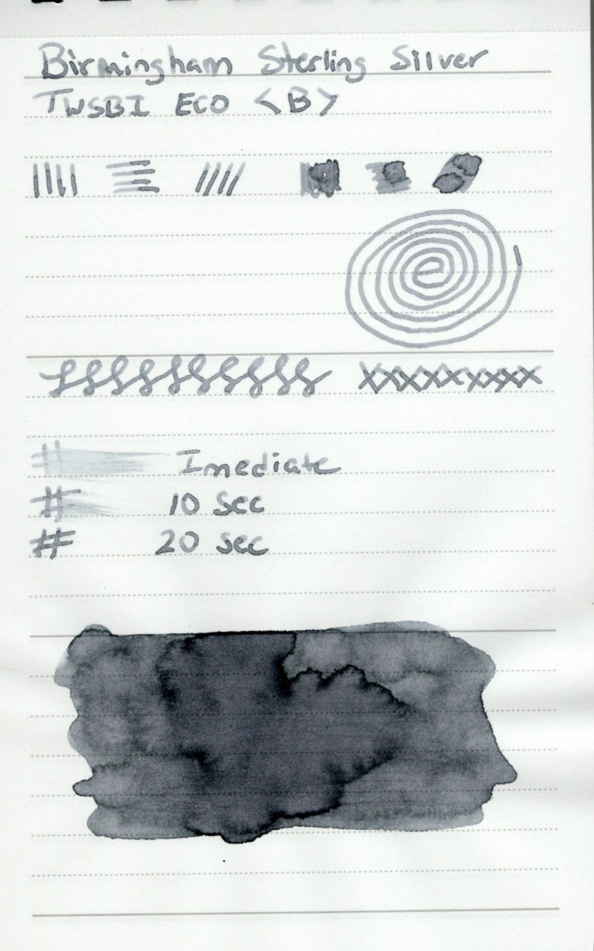
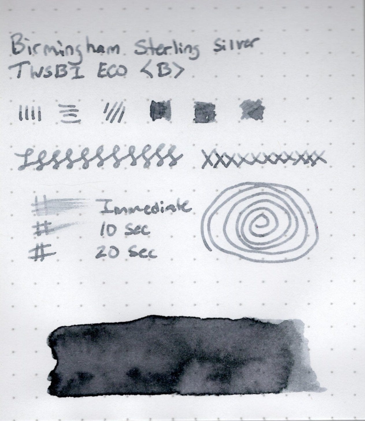
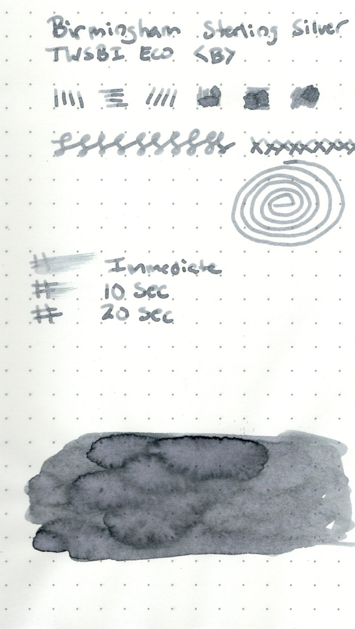
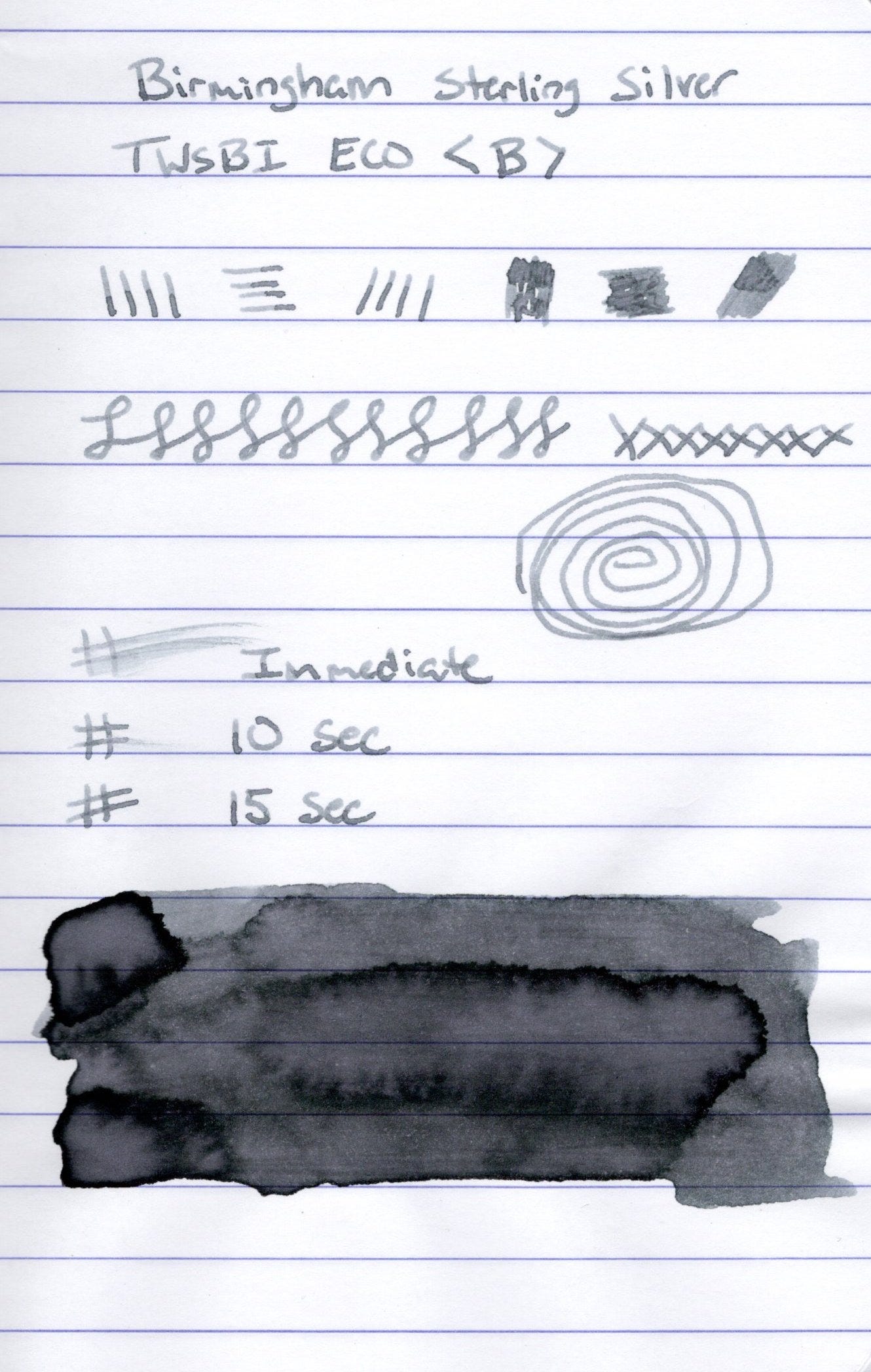
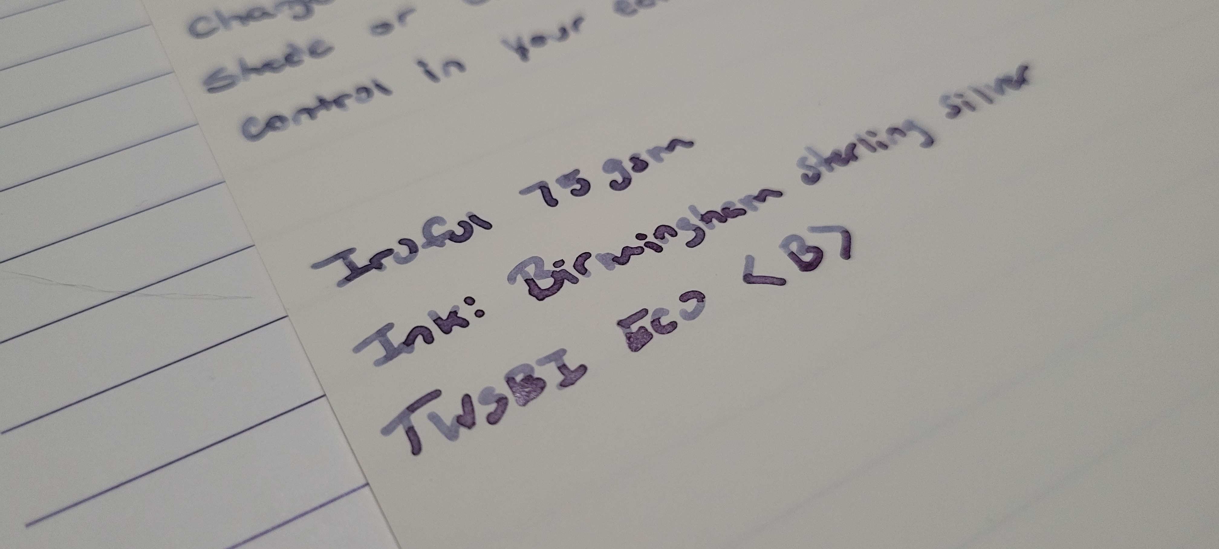
Longer writing samples on Tomoe River and Iroful paper. On all the papers the ink is smooth to write with, even on the Iroful which sometimes feels grabby. The ink goes down that dusty purple and dries various shades of cool grey, blueish-grey. Heavy shading on each paper.
The ink performs very well, as expected. It’s a nice solid ink with beautiful chromashading effects across various papers. This ink shades for days on all the papers I used to test. I'd say this is another really complex ink due to the chromashading properties. Not much line variation, as expected, from a stock broad nib, the ink however is very wet in this nib. Writing was smooth on all papers and the ink is nicely saturated. Dry time varied depending on the paper, between 10-20 seconds, a quick drying ink. This is definately one of my top 5 inks.
PS - All ink reviews are my own and have been purchased with my own dollars.
Interesting, it reminds me of Pilot Iroshizuku Fuyu-Syogun, rich is good because it means I don't feel instantly compelled to pick up this BPC ink, despite how appealing it looks in your swatches and samples! 😅
Well… now you have ink abled me and I feel like I “need” this. Truly it can be so hard to find a good cool grey. This one looks amazing!!! 🤩