
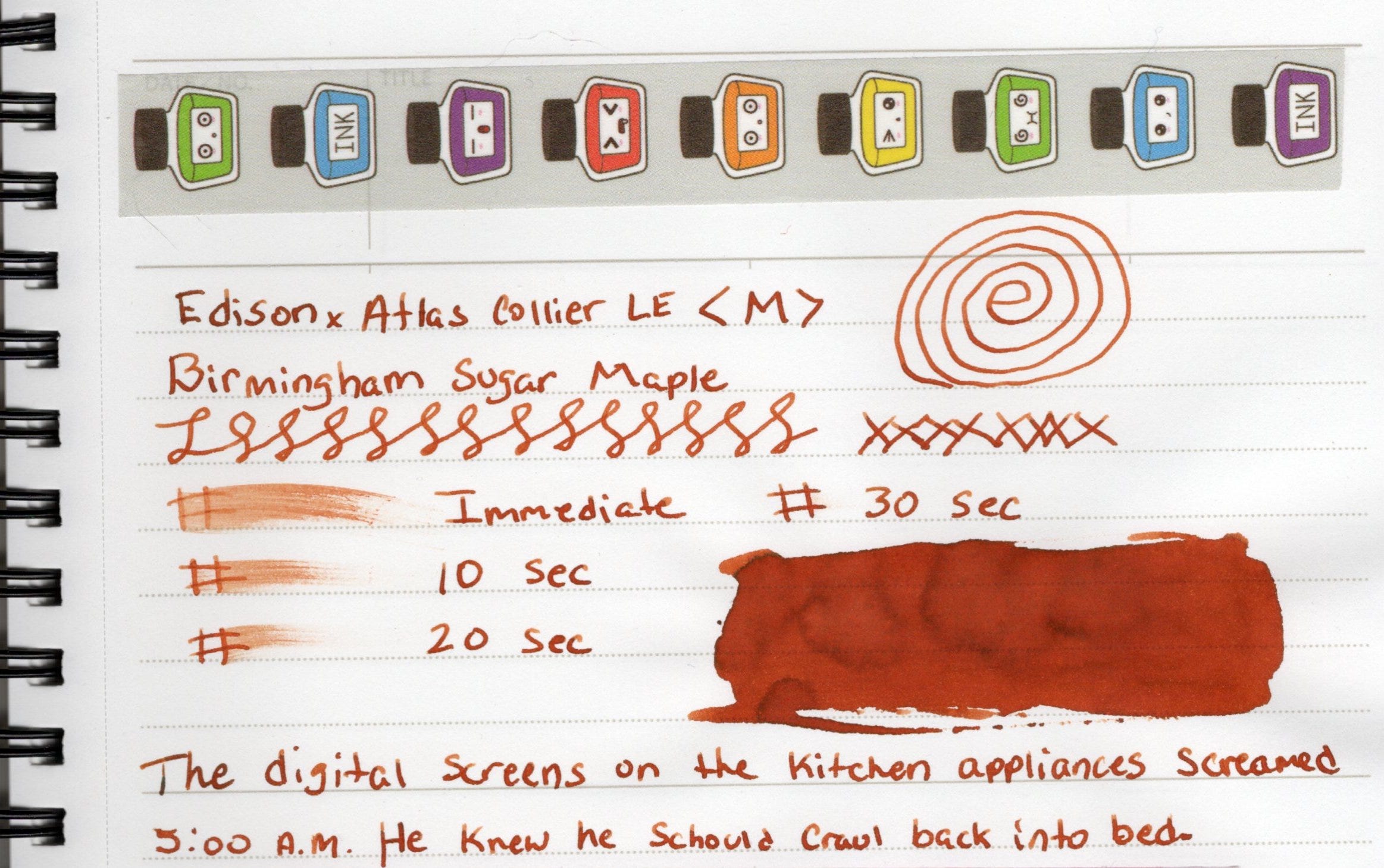
Birmingham Sugar Maple

Sugar Maple is part of Birmingham Pen Co's standard ink line called the Keystone Formula. This was given to me for Christmas last year. Unfortunately as of this writing the ink is out of stock. I'm drawn to Birmingham inks because of the references to my hometown. The ink colors remind me of certain times of day dusk or dawn over the city or colors that say for example, the Ohio or Allegheny Rivers take on. Or pays homage to the city's steel town past.
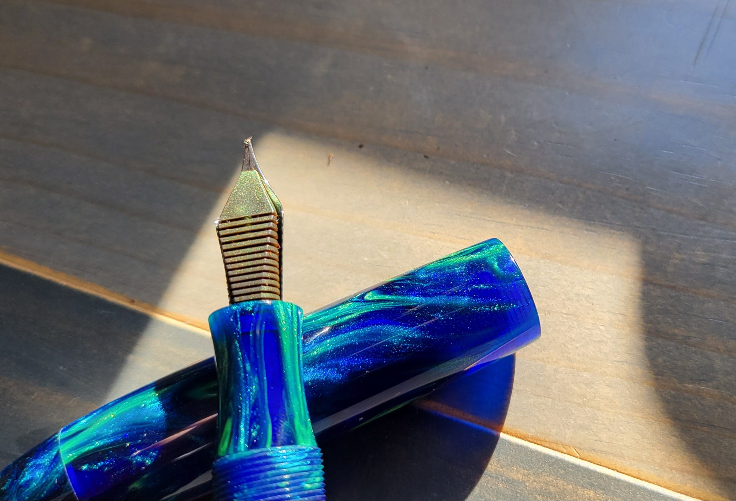
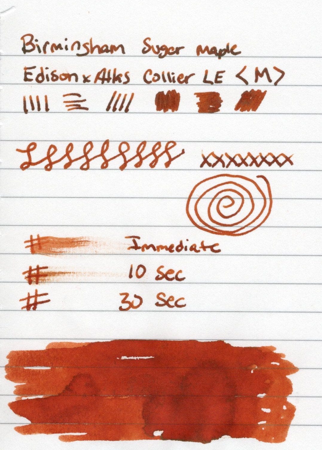
On the Birmingham website this is a nice bright orange. Swatches there also show some dark shading. I inked this up in an Edison Collier with a medium Jowo #6 nib. You'll see my swatches of Sugar Maple are darker, even on Tomoe River Paper. Birmingham inks tend to be a surprise. Which is A-OK with me.
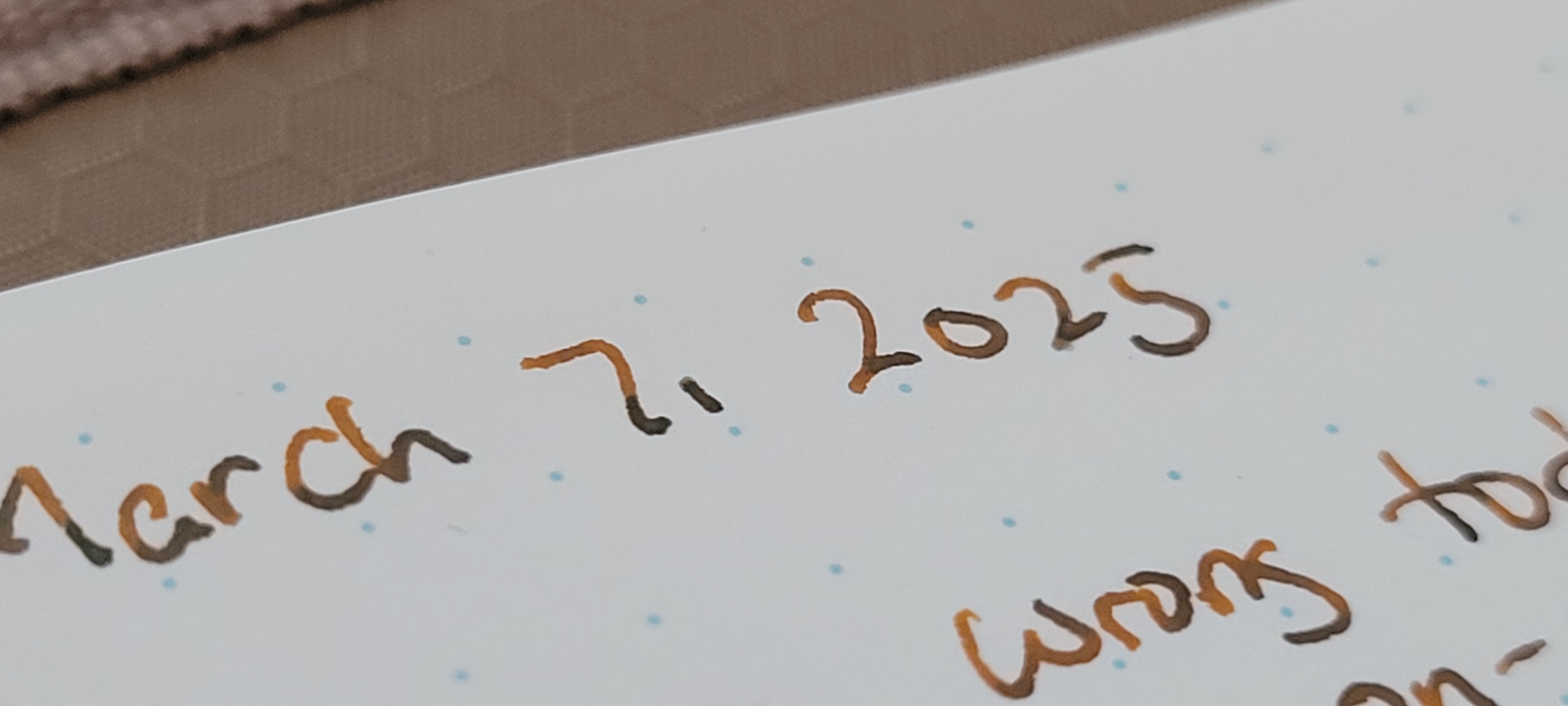
I started to notice that my nib was covered in sheen, and isn't that interesting? This ink isn't advertised as a sheener. After a few writing sessions, I also noticed that the first few words written appear to have a green sheen / shade to them. I thought this was really cool and made this ink complex. I thought it may be due to the cap seal on my pen, which it may have been? Also I started to notice in heavier areas of lettering that the shade I saw was maybe a green sheen?!
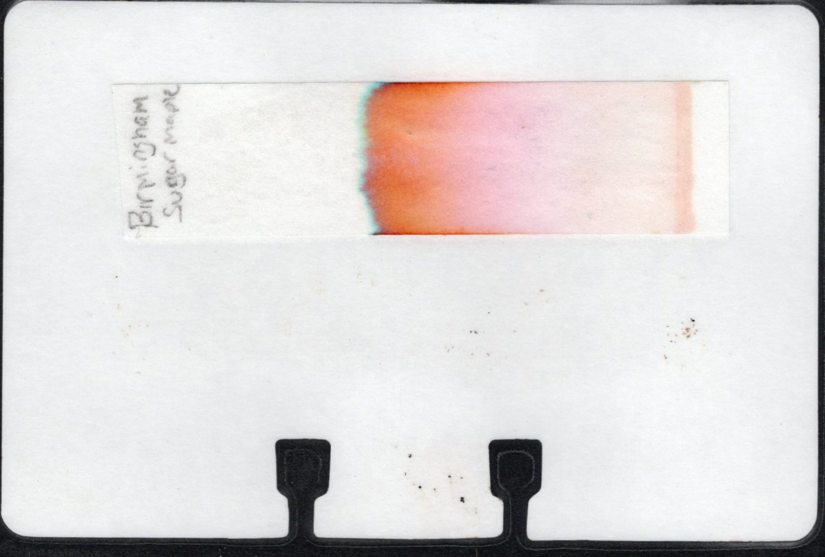
The chromatography showed a little bit of green toward the top with a majority of the color being orange, as expected and a tiny amount of pink. If I look suuuper close I can just make out a small yellow line just below the green.
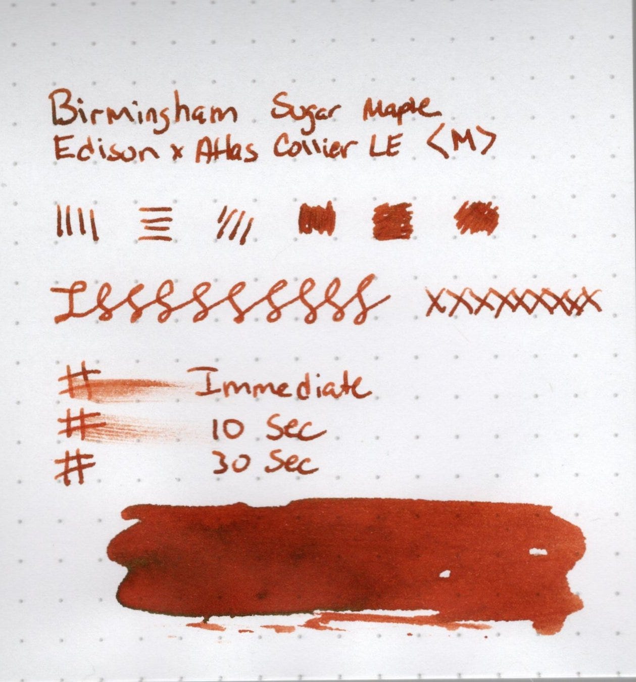
Sample writing, swatches and line variation tests on small test notebooks from Mauraman Mnemosyne, Apica, Travelers, Rhodia, and Clariefontaine. These swatches are done with Dominant Industry's new ink muddler. A tool I've been using more often to do my swatches, both in my small testing notebooks and on my swatch cards. The green sheen comes through on the Mnemosyne and Travelers paper the best. Rhodia and Clairefontaine are showing the sheen slightly on the edges. While on the Apica, it appears as black shading.
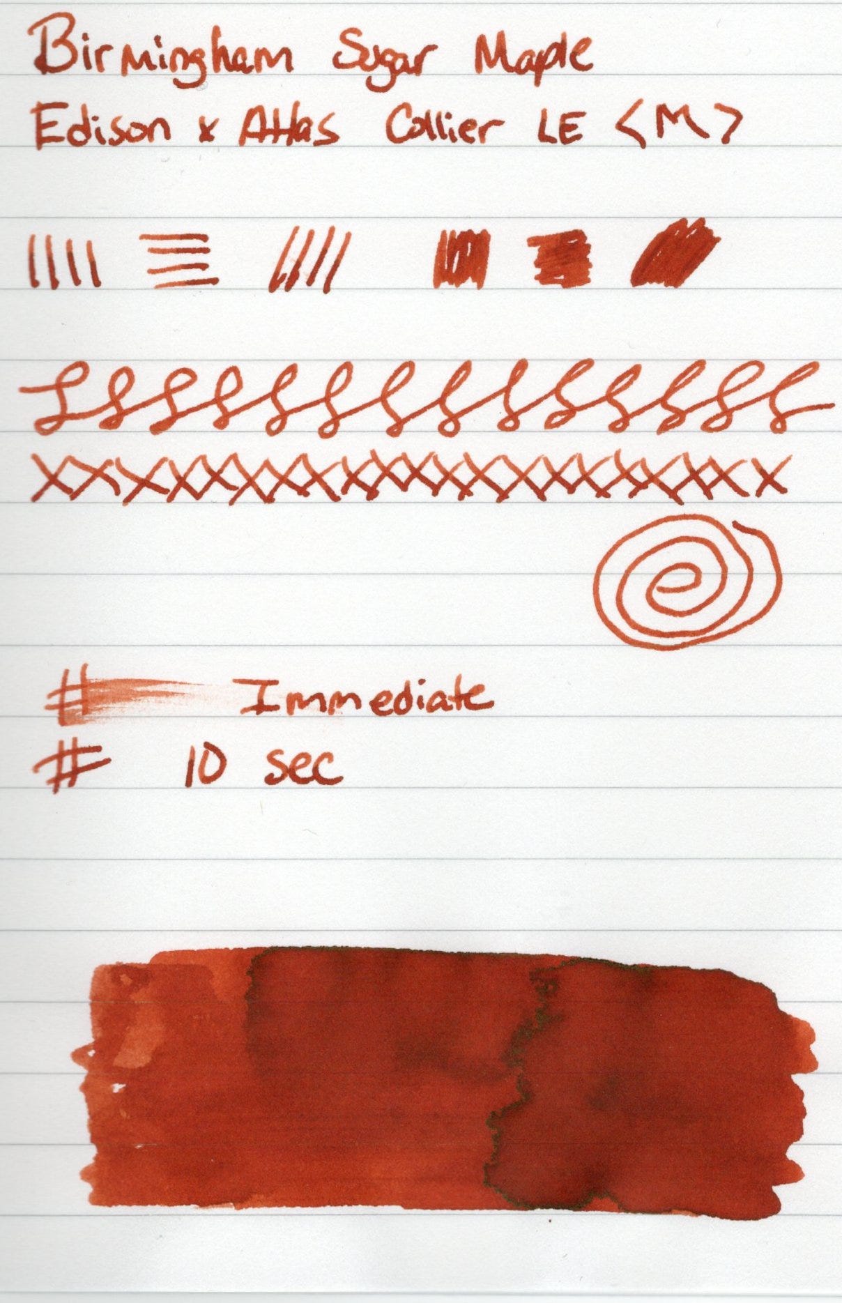
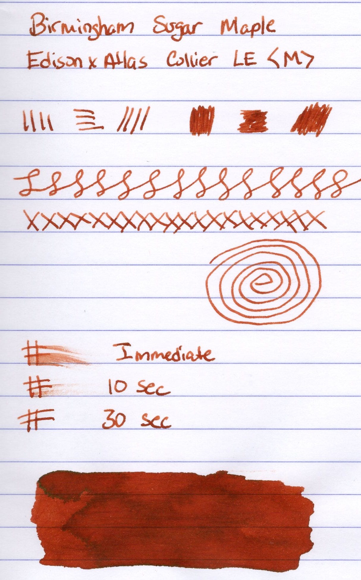
Longer writing samples on Tomoe River and Iroful paper. Iroful shows the green sheen in the beginning of the page. I think this is due to the good cap seal on the pen. Writing was nice and smooth on the pillowy Iroful paper. The color also seems to be more saturated and brighter on the Iroful paper.
The ink performs very well. It’s a nice solid standard ink with some complexity that writing sometimes is sheeny and sometimes the same effect shows shading. I got a nice line with nice a wet flow. Writing was smooth on all papers and the ink is nicely saturated. Dry time varied depending on the paper, between 10-30 seconds.
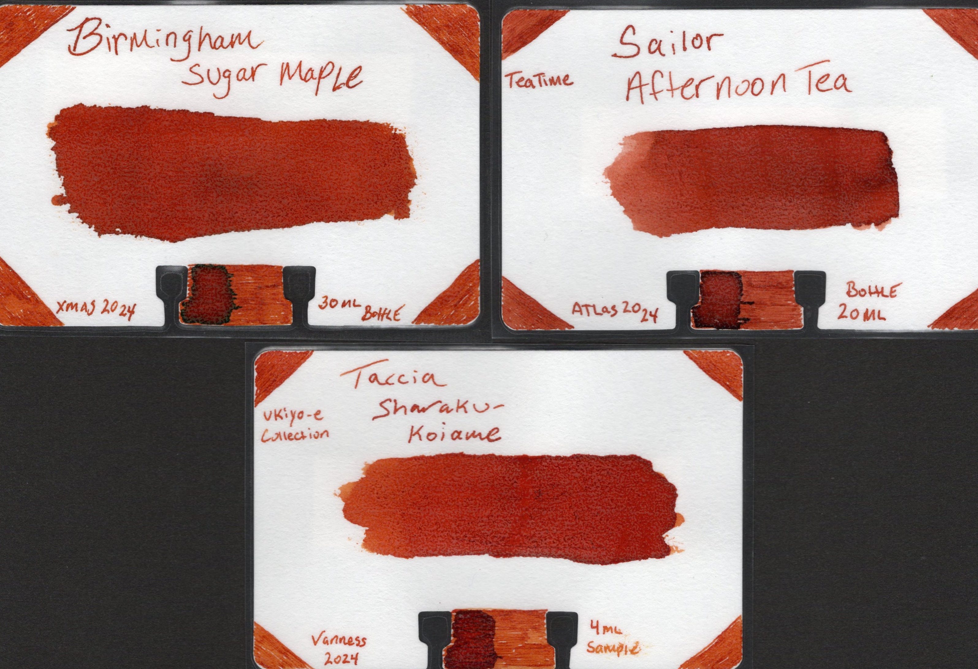
I think I am nearing the point in my collection where I can make some comparisons for a few inks. Similar to Sugar Maple is Sailor Afternoon Tea and Taccia Koi-ame. Two of my other favorite darker oranges.
PS - All ink reviews are my own and have been purchased with my own dollars.
That's a nice looking red. And I agree about Birmingham's Keystone Inks. I have several, and my (current) favorites are Chinchilla and Eucalyptus Stem.
One of my favorite posts so far! Appreciate how descriptive you are.