The Wet Pen Inks

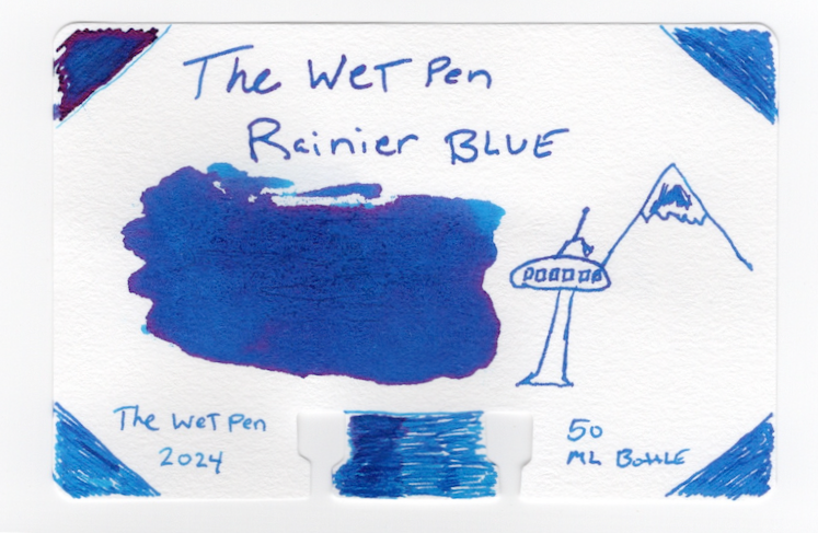
It's the middle of September (Almost end by the time I post this) and I recently got my first order of The Wet Pen inks. I've very excited. I ended up with Deception Pass, Elliott Bay and Rainier Blue. I know these are the first inks that were made, and I believe these are the second batch. The Rainier I couldn't pass up. Several years ago I visited Mount Rainier and it was life changing. I will never forget sunrise on the mountain, with it's yellow glow on the snow capped peak and the beautiful blue water at Tipsoo and Mirror lakes. So it was only natural that I couldn't pass up this color.
The Process
I swatched up each color. I took a page from Inkdependence Mike, using the bigger Col-O-Dex rotary cards from The Well-Appointed Desk. I used my Pilot Iro-Utsushi to color the corners, this let me see if the ink was on the wetter or drier side due to how much ink was on the nib and how many times I had to re-dip. I do this with the bottom of the card too. Then I switch to my Teranishi Guitar Glass Pen to add a second layer to half of the bottom of the card and write out the name of the ink and sometimes do a little drawing. The large ink swatch I did with some tools that I picked up from Amazon, searching "micro spoons."
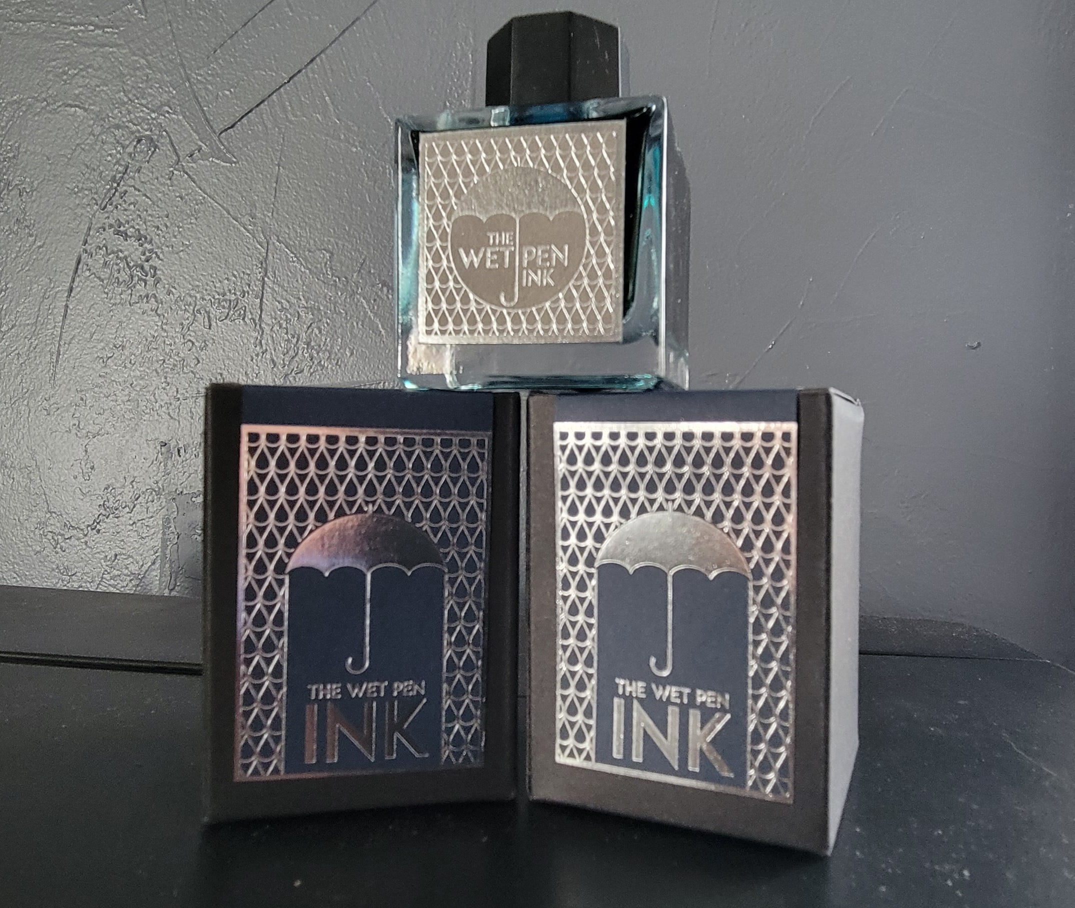
First, the packaging and bottles are stunning and I was very impressed right off the bat. The bottles have some substantial weight to them. The only thing I would say is I'd like to see the ink name on the label somewhere, instead of a sticker on the bottom.
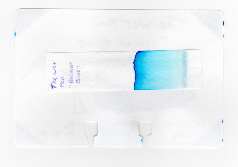
I found all three Wet Pen inks to be wet and laid down nicely on the card. Rainier blue was beautiful and captured my memories of Mt. Rainier National Park perfectly. The chromatography revealed a pure blue. The magenta shading really came out in the sample, especially because I forgot to wipe the side of my dip pen before putting down ink, in the one corner. I got a monster amount of ink on that side and once dried, it shines.
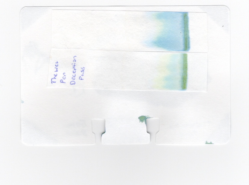
Next was Deception Pass. Off both the dip pen and glass pen it was beautiful and held well to both nibs. The ink, first went down as blue-grey and dried green. I really thought this was a beautiful color with interesting shader properties as it dried. The chromatography shows some faint yellows, greens and blues. I at first I did the strip wrong so I did too, the yellow shows up more so on the one strip then the other.
Elliott Bay, the sibling ink of Deception Pass is more of a medium greyish blue (to my eyeballs). The chromo shading didn't quite come through for me on the col-o-dex card as it dried, although the green did start to come through slowly, but I didn’t get a much from the swatch. It shows up much better in the scans. I used the other side of the col-o-dex card for this one, so maybe that has something to do it. I think once I do some sample writing on various papers this ink will come out even more, especially in a broad nib.
Overall, I really liked all of these inks. I cannot wait to order Matthew Gore's second batch of ink that he recently released. I also can't wait to ink these up in my pens. I have a feeling Rainier blue will quickly become my go-to blue.